Brand
Legion Brand Guidelines
Logos, colors, type, voice, and usage rules. Use them well.
Logos
Download allTwo wordmark weights. Pick by context: the thick wordmark stands on its own when the brandmark icon is absent. The thin wordmark sits next to the brandmark so the two read at a balanced weight. If in doubt: brandmark present → thin, brandmark absent → thick.







Clear space & minimum size
Give the brandmark room. Clear space on all sides equals the brandmark’s own height. Never let other elements crowd it.
 = brandmark height
Minimum size — brandmark
16px digital · 10mm print
Below this the rounded forms collapse and the mark stops reading as Legion.
Minimum size — wordmark
80px wide digital · 25mm wide print
Use the thin variant only above 120px. The thick variant scales further down.
16px32px64pxMisuse
Don’t do any of these. If you find yourself reaching for one of these treatments, the answer is almost always the plain mark on a calm background.
Don’t stretch or squash
Don’t recolor
Don’t add shadows or effects
Don’t rotate
Don’t use on low-contrast backgrounds
Don’t outline or frame
Co-branding lockups
When Legion appears alongside a partner mark, like a GP firm or a press feature, use the thick wordmark and separate the two with a vertical rule. The gap on each side of the rule equals half the wordmark’s cap height. Both marks sit on the same optical centerline.
 Partner
Social & share cards
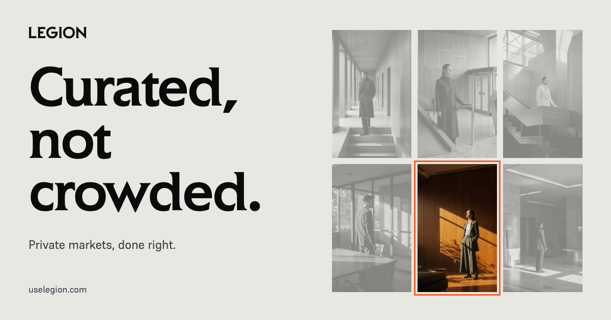
Default Open Graph card is 1200×630. Use the wordmark thick variant on Ink for any custom card. Leave at least 80px of clear space around the mark.
Photography & imagery
Imagery should feel like a feature in a financial newspaper, not a sales brochure. The five principles below apply to every photograph, render, and illustration that ships with the Legion name.
- Editorial portrait, not corporate headshot. Think magazine feature, not LinkedIn banner.
- Subjects look like considered adults. Tailored clothing, calm posture, direct gaze. No props, no laptops, no forced smiles.
- Natural light or a single soft source. Shadow is welcome. No ring lights, no flat key fill.
- Wardrobe and set stay inside the greyscale spectrum. Legion Orange only as a small accent: a tie, a flower, a wall behind the subject, never a full fill.
- Composition: tight crop or generous negative space, nothing in between. Subject off-center. Calm, not busy.












Typography
Liquid when life changes.
Elan · Used for headlines and section heads.
Get Elan Book ↗Elan Book only. Never use Elan Bold, Black, or any heavier weight. The book weight is the entire brand voice of Elan — heavier cuts read as a different typeface and break the system. If you need emphasis, use italic or scale up. Do not embolden.
Liquid when life changes.
Liquid when life changes.
ABCDEFGHIJKLMNOPQRSTUVWXYZ
abcdefghijklmnopqrstuvwxyz
0123456789
Supreme · Used for paragraphs and UI.
Get Supreme ↗const legion = { type: "brand" };
Geist Mono · Used for code and figures.
Colors
Primary Orange
The heart of Legion.Primary accent. AA Large (3.0:1)
Accent for text. AA pass (4.5:1)
Decorative only (2.4:1)
Surface tint (1.1:1)
Greyscale Spectrum
Eight tones, forged for clarity.Deepest dark. AAA (18.8:1)
Primary dark background. AAA (14.7:1)
Text on light. AAA (10.1:1)
Secondary text. AA (7.2:1)
Muted text. AA (5.2:1)
Borders and dividers
Surface on light
Primary light background
Semantic Signals
Used sparingly. Recognized instantly.Confirmation and success states
Success surface
Errors and destructive actions
Danger surface
Voice & tone
Warm bluntness. Short sentences. Plain words. The reader is a smart adult who is short on time. Write the way you would explain it to a friend over coffee: confident, specific, never breathless. No em dashes. No corporate filler. No “leverage”, no “empower”, no “robust”.
Legion makes private markets liquid. List your fund. Find investors. Move on with your life.
Legion is a cutting-edge platform leveraging best-in-class technology to empower fund managers with robust capital-raising solutions.
You spent years building a track record. You shouldn’t spend another two raising your first fund.
Boilerplate
Three lengths for press and partner copy. Use verbatim. If you need to edit, follow the voice rules above.
Legion is a private markets marketplace that connects emerging fund managers with sophisticated investors. We make the world of private capital more liquid.
Legion is a two-sided private markets marketplace. We help emerging fund managers raise capital from a curated pool of sophisticated investors, and we help investors find the next generation of standout managers before everyone else does. Liquid when life changes.
Legion is a private markets marketplace built for the next generation of fund managers and the investors who back them. Today, the best emerging managers are hidden behind warm intros and closed networks. The best investors spend years building the relationships needed to find them. Legion changes that. On one side: a curated cohort of founding general partners with real track records and clear strategies. On the other: sophisticated investors who want allocation into the funds that will define the next decade. Between them: tools for diligence, allocation, and secondary liquidity that simply did not exist before. We are building the marketplace that private markets should have had ten years ago. Liquid when life changes.
Usage
- Wordmark alone: use the thick variant.
- Wordmark paired with the brandmark icon: use the thin variant so the weights balance.
- Don’t recolor the logos. The brandmark works in white or in #1c1c18.
- Give the brandmark clear space equal to its own height on all sides.
- Use Legion Orange sparingly — for emphasis only, never for body text or large fills.
- Elan is Book weight only. Never Bold, Black, or heavier. For emphasis use italic or scale up.